The brief for this fun and vibrant website needed to fuse stylish and clean design with liveliness and contain features rich in modern functionality. There is a clear and inherent emphasis on people’s lifestyle and the company’s staff.
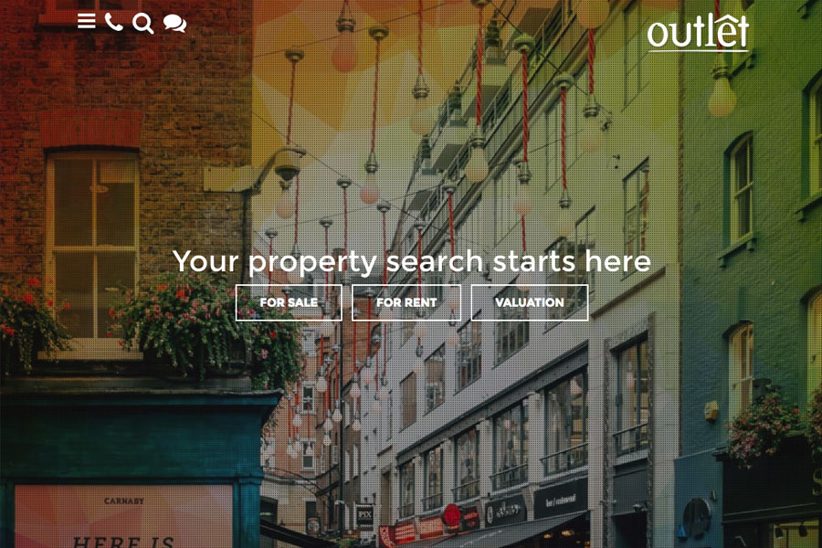
All imagery on the site has had a colour filter applied in addition to an overlay creating an artistic effect whilst allowing the client corporate colours to stand out from the graphics. The main space on home page is clean and simple with clear call to actions. Clean and modern animations are omnipresent across all functional integrations, for example the burger menu and search icons.
A nice feature on this site is the blog integration which can be accessed by clicking on the speech bubbles icon. This pulls out a blog/news preview vertical strip without the user necessarily having to visit another section and makes it easier for users to read the information you want them to.
As we move down the home page you will see various horizontal strips of features that link off to different areas of content and functionality in the website.
This particular design showcases our embedded video article and ‘success stories,’ home page features. The success stories idea was to make a testimonial section more than a standard comment and name and realise the real human story behind every home move.
The homepage also features a beautiful array of themed imagery designed to cross link to your featured articles.
Continuing the human theme on the homepage is the meet the team section where the team member photos are featured in black and white and change to a different ‘engaged,’ version and colour on hover. Each team member then has a full page dedicated to his own write-up.
