It was clear from the outset that John and his team wanted to capture a local and personal feel for their new website whilst maintaining the highest levels of professionalism. To this end we started with modernizing the brand and used this as a starting point.
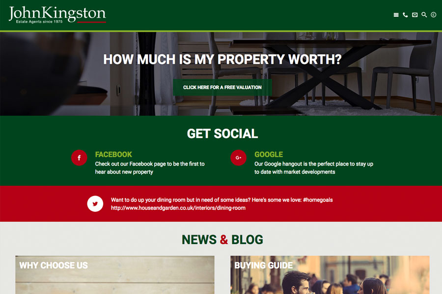
This particular website has been designed as a clean and graphical showpiece. Although the top section here showcases a panning slideshow of local imagery this can be replaced with video or still imagery. The important element is the prominent valuation button and header text configured for SEO.
Below the specifically sized hero graphic users will be able to see the search bar meaning that all relevant call to actions are visible on the one screen without the need to scroll. This will be the case on any device due to the responsive abilities of the website.
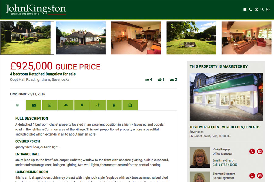
This site also presents our innovative to search by school or railway station and also allows users to view their results on a map or draw their own search on a Google map.
The home page has been designed for ease of use for mobile and desktop users who will intuitively know to scroll down to view a number of components that cross link to other areas of the website. You can see other website example in our gallery to view a huge range of different home page components however here you can view a Latest Properties scroller, testimonial bar, valuation repeater, social media and collage of images that link to prominent articles.
You’ll also notice that the main navigation bar stays with you as you scroll down through the page enabling the user to always have access to prominent call to actions.

