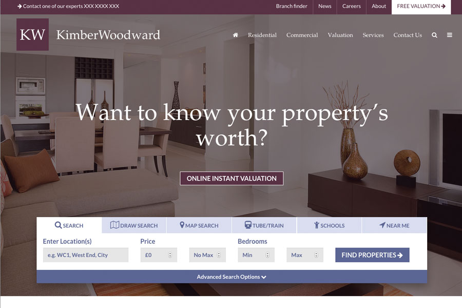
The home pages features a full screen image however the top menu and search bar containing a variety of search options creates a perfect balance of graphic to function reality. In addition the all important valuation request button takes centre stage.
A full simple layout still allows for maximum impact or subtle brand fusion. A unique and styled feel has also been created with use of illustrated graphics enhancing the professionally designed feel.
A prominent feature is the search bar with tabs for a variety of search methods. We realise the importance of easy search and high property visibility on our websites even if the majority of buyer traffic is via the portals. This is because a lot of buyers will test a prospective agent’s website to see how easy it is to locate a property. Without having any is a risk that you may lose the lead before they contact you.
The sticky top menu bar ensures that all prominent items are always visible as a great deal of importance is dedicated to getting users to engage with your content and make enquiries via specifically placed call to actions. Another nice effect is the client logo that reduces in size onto the sticky navigation bar as the user scrolls down from the top of the page.
Below the main header image where the search and valuation buttons take centre stage can be found a selection of available components such as a welcome text introduction, featured articles, news articles, testimonials, local area guides, testimonial preview and social media connections. On a responsive view the header image formats neatly onto one screen where users will intuitively know to scroll down to access other useful material.
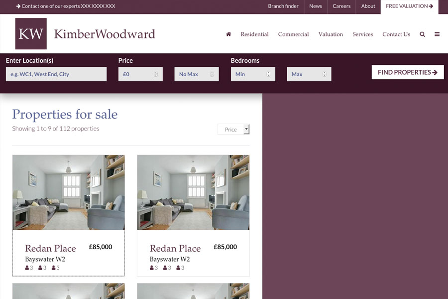
The Kimber Woodward site also contains variants of article page layouts with increased use of imagery, side navigation menu and slide in menu systems.


